
Brand Identity
Illustration
Ongoing Creative
● Work
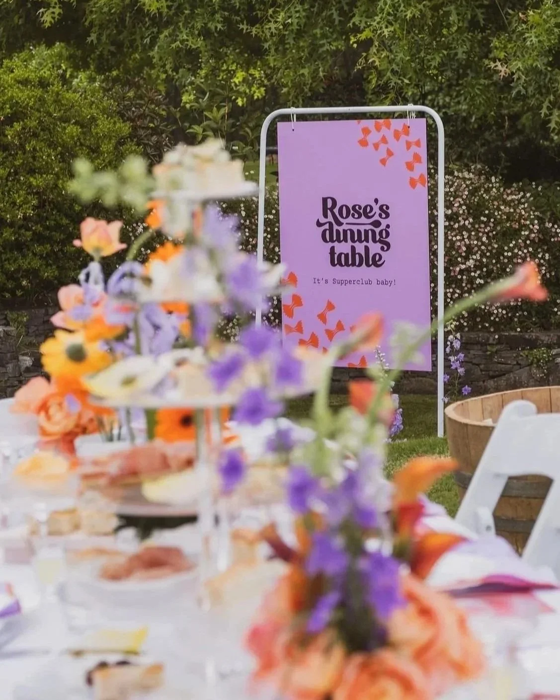
Rose’s Dining Table
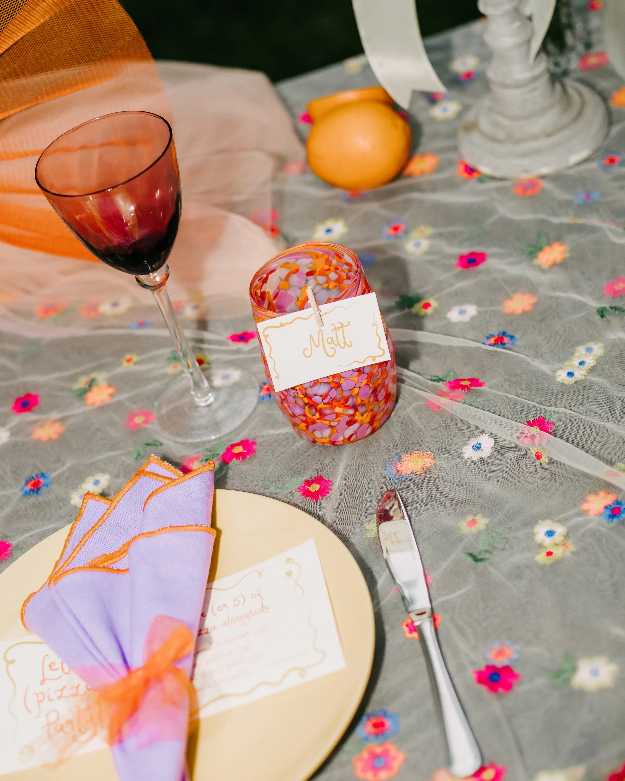
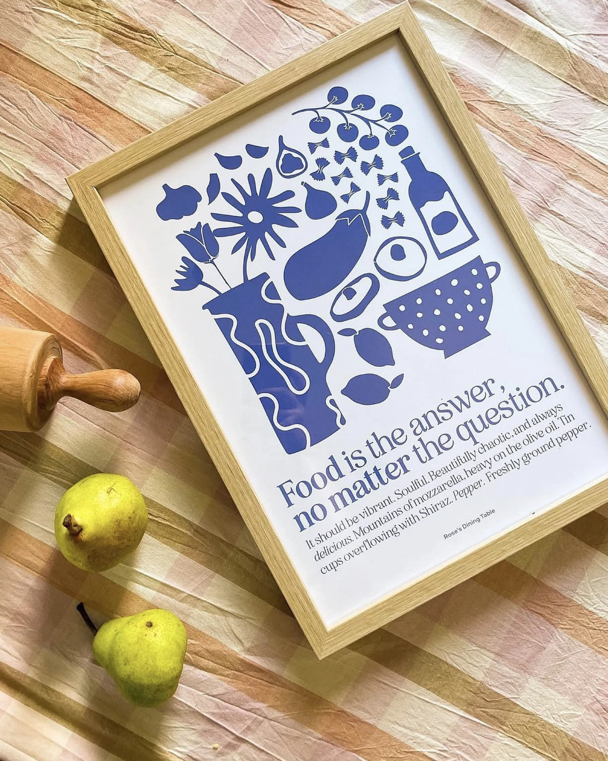
You’ll find Rose dreaming up crazy fun foodie concepts to share with her fans. The brilliant and creative Supperclub host who turns food into art and strangers into friends.
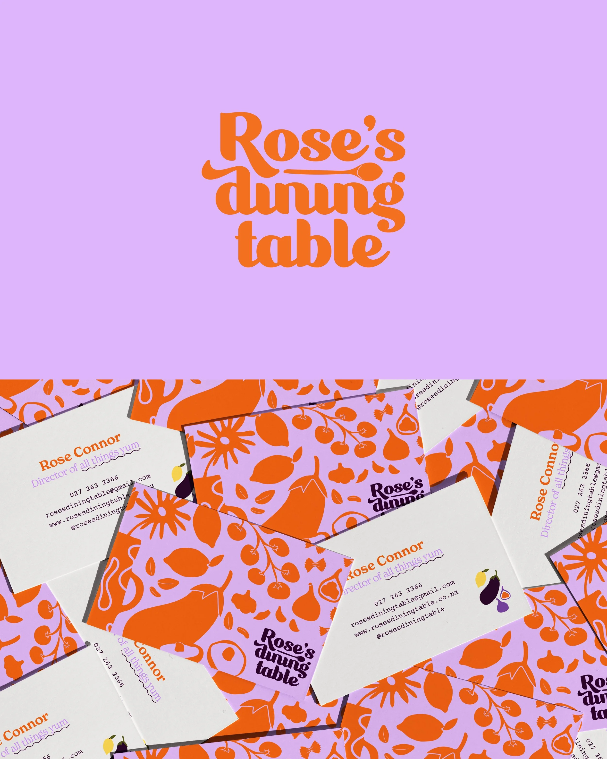
She originally came to me for a Brand Edit, but as we got into the project it became clear that RDT needed a full brand identity. One of my proudest branding projects to date, Rose is a force and knows exactly what she wants, so collaborating on this and bringing her vision to life through the branding felt like a huge achievement.
RDT feels like a true SameKind brand: quirky and bold, but still modern, considered and versatile. Since creating the brand, we’ve continued working together on smaller RDT projects, as well as Rose’s own wedding signage and stationery.
What we created:
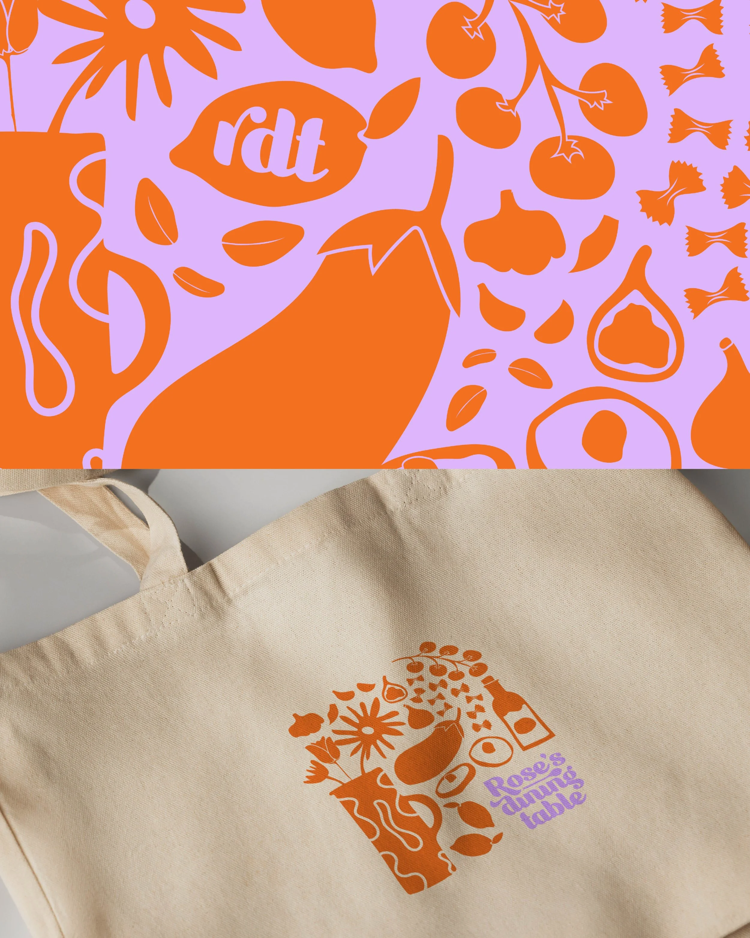
Full brand identity
Logo suite
Custom hand-drawn brand assets
Colour palette
Brand guidelines
● Work
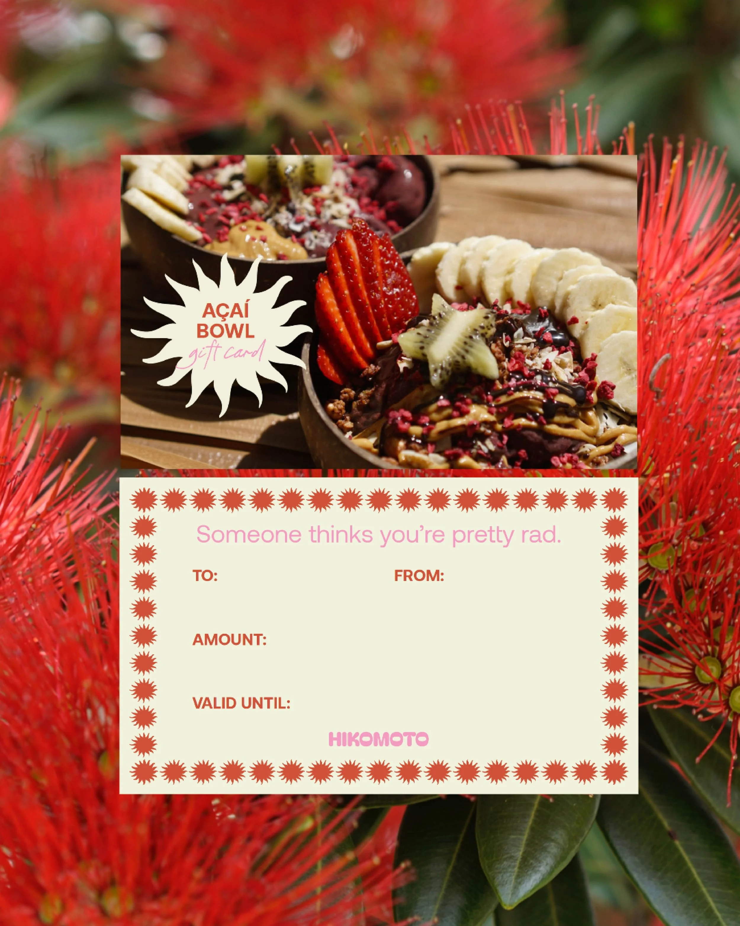
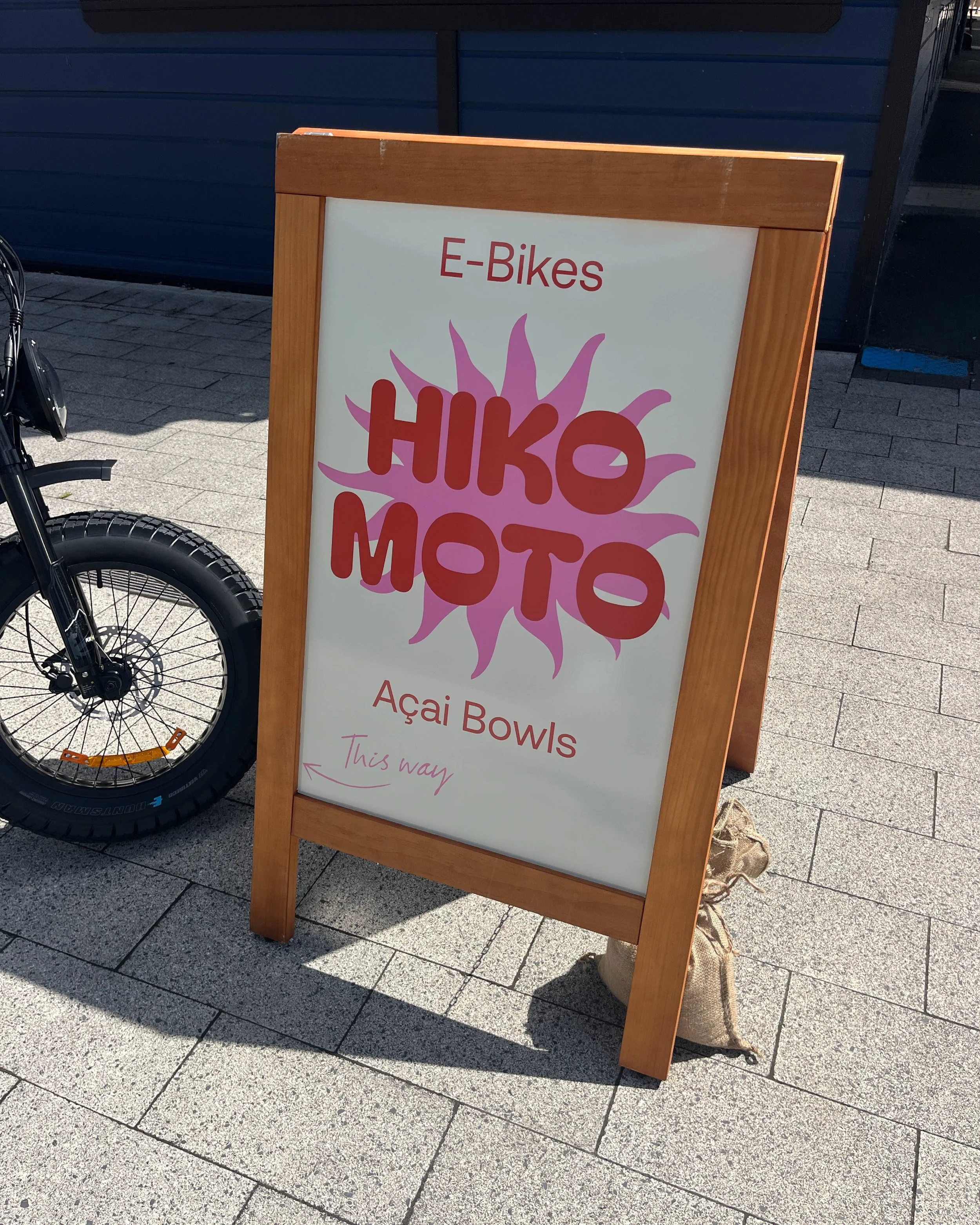
Hikomoto
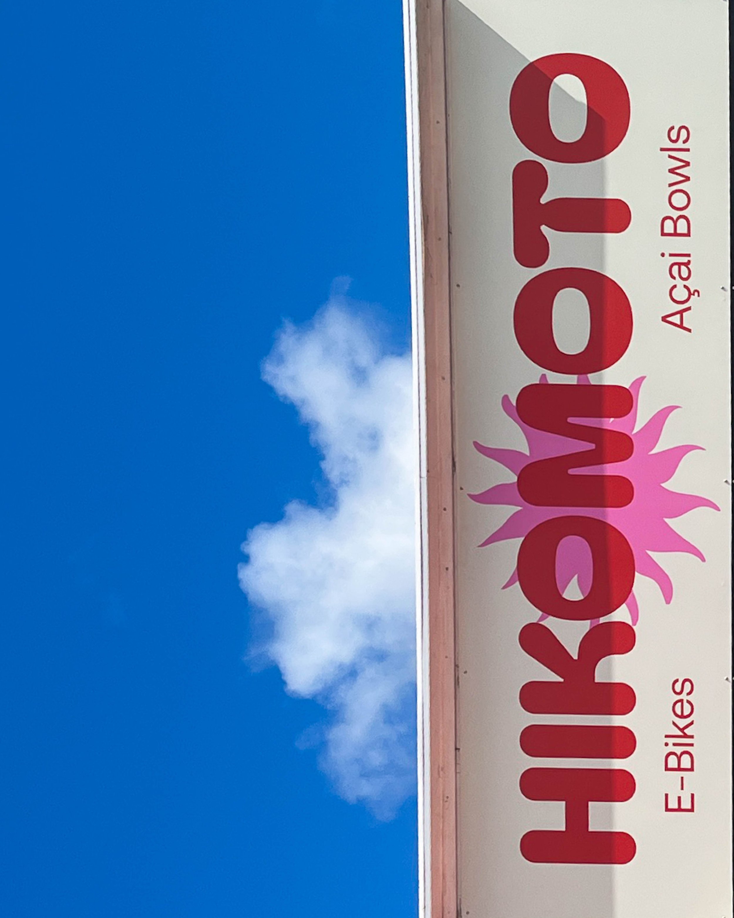
Hikomoto was a pop-up store in Whitianga, renting e-bikes and serving açai bowls throughout the summer.
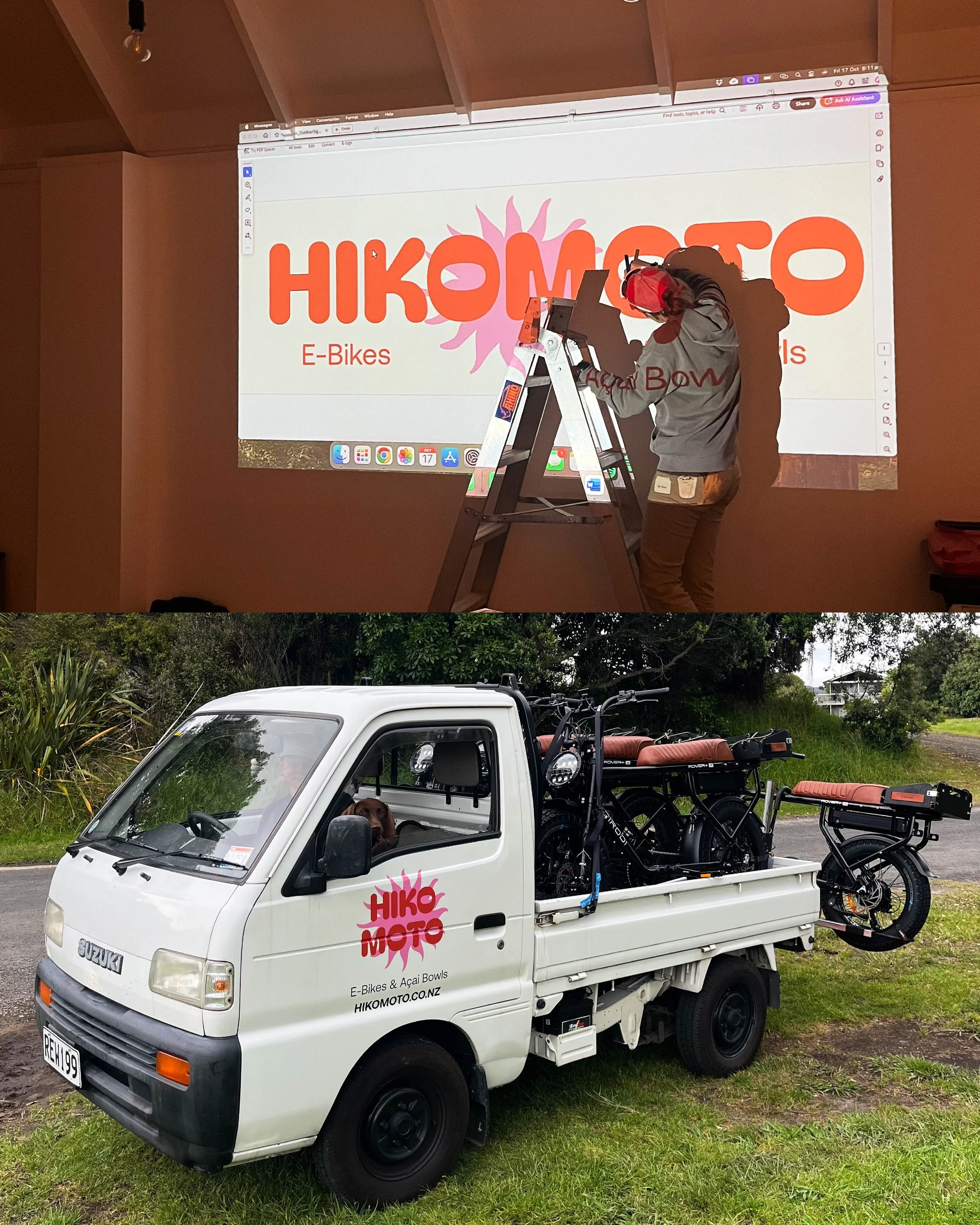
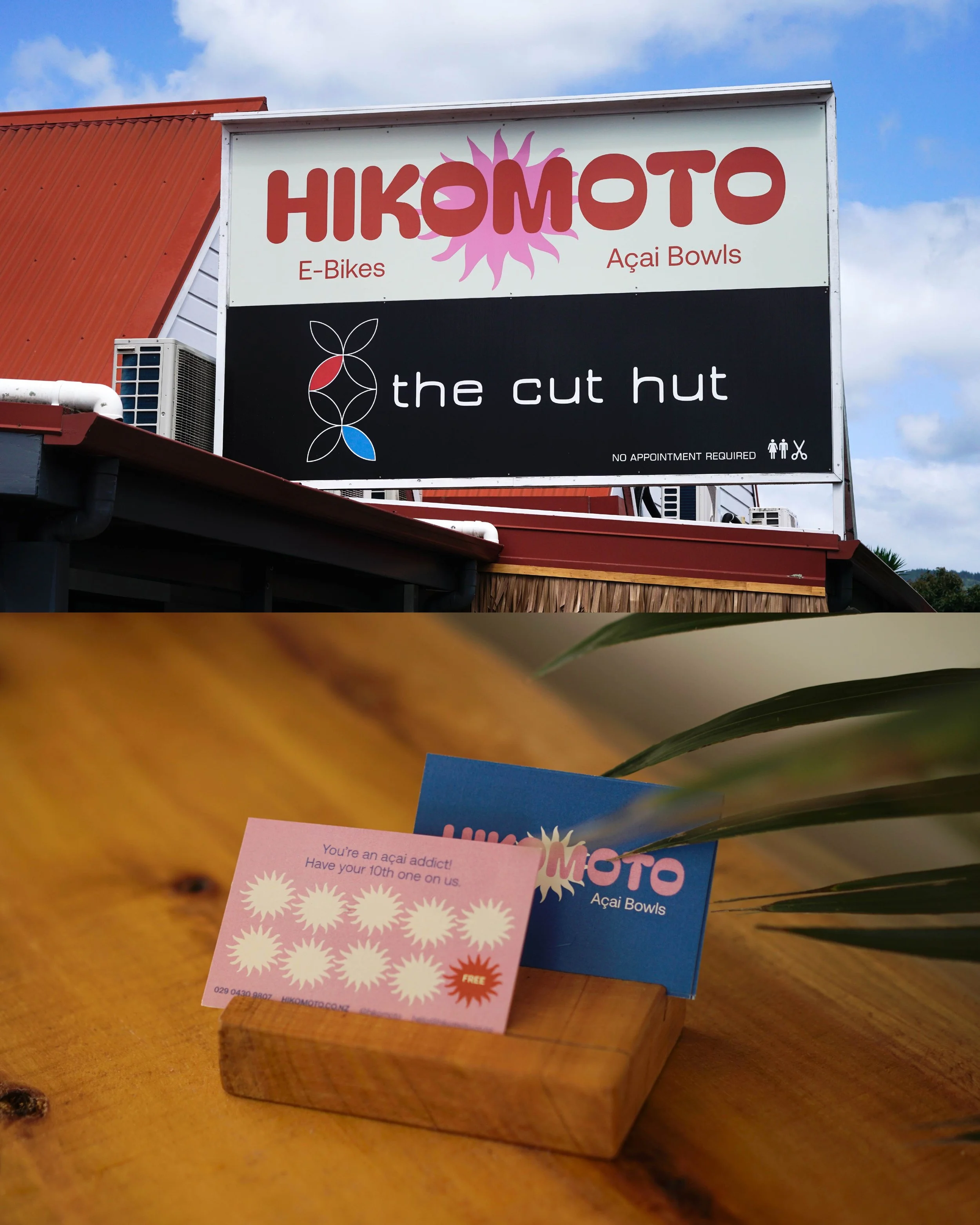
This was a Brand Edit that rolled into print collateral, signage and vehicle sign-writing as the business came to life. We combined funky typography with bold colour to give the brand a playful, energetic feel with a nod to those nostalgic summer missions.
What we created:
Brand Edit
Logo refinement
Colour palette
Typography
Print collateral
Signage
Vehicle signwriting
// @hikomoto.nz
Brand Edit
Print & Signage
Vehicle Signwriting
Brand Identity
Brand Identity
Squarespace
Website
Brand Identity
Squarespace
Website
Brand Identity
Print Design
● Work
The Eggsentric Cafe
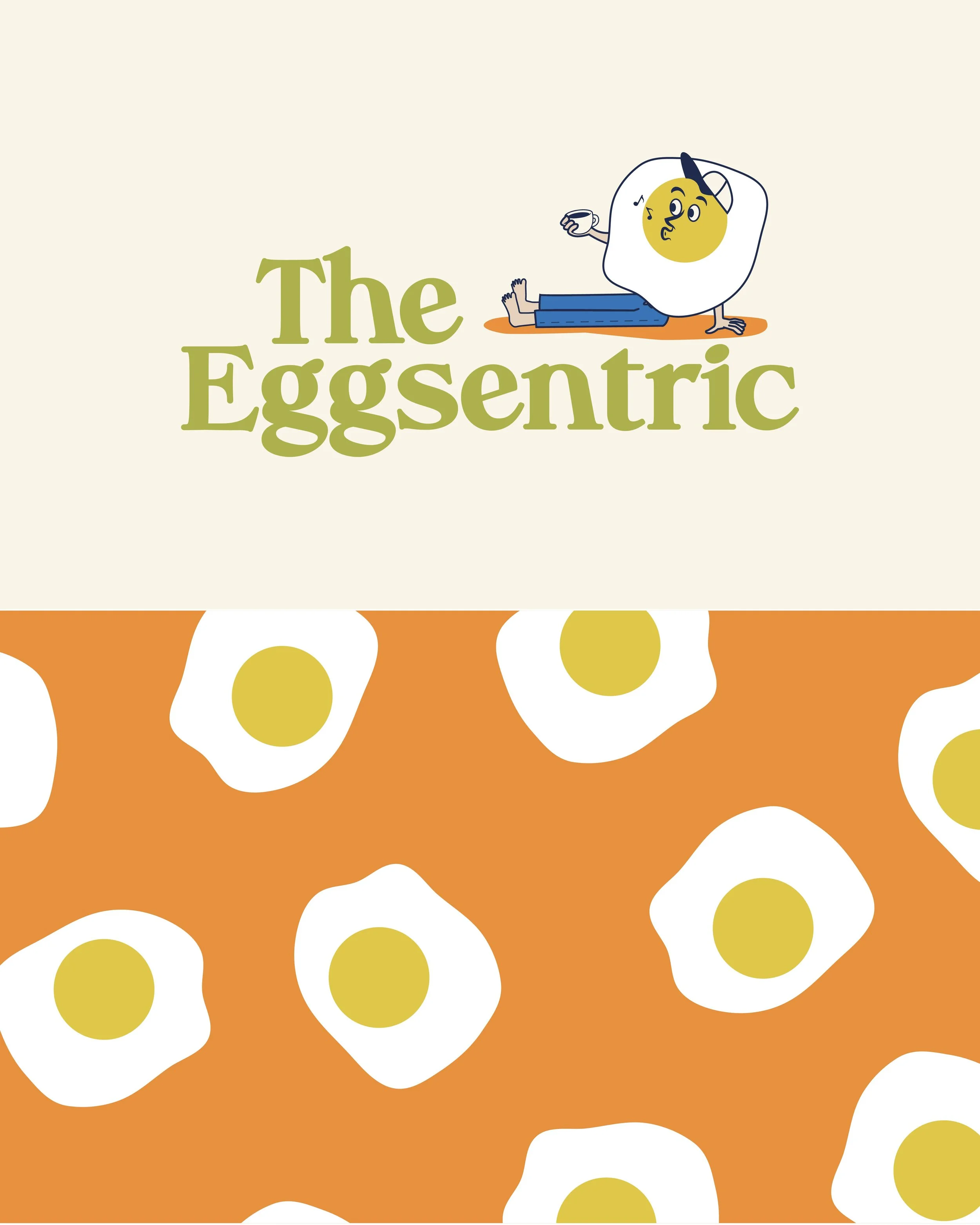
The Eggsentric is a long-time local fave in Flaxmill Bay, Coromandel known for its eclectic, arty vibe, epic coffee and very loyal customers. So when they approached me for a rebrand, I knew it was a big one.
They had plenty of inspiration already sitting within the cafe, from the colours to the illustrations, so I took those cues and pushed them as far as I could. With full creative freedom and “the quirkier, the better” as the brief, the Eggman was born.
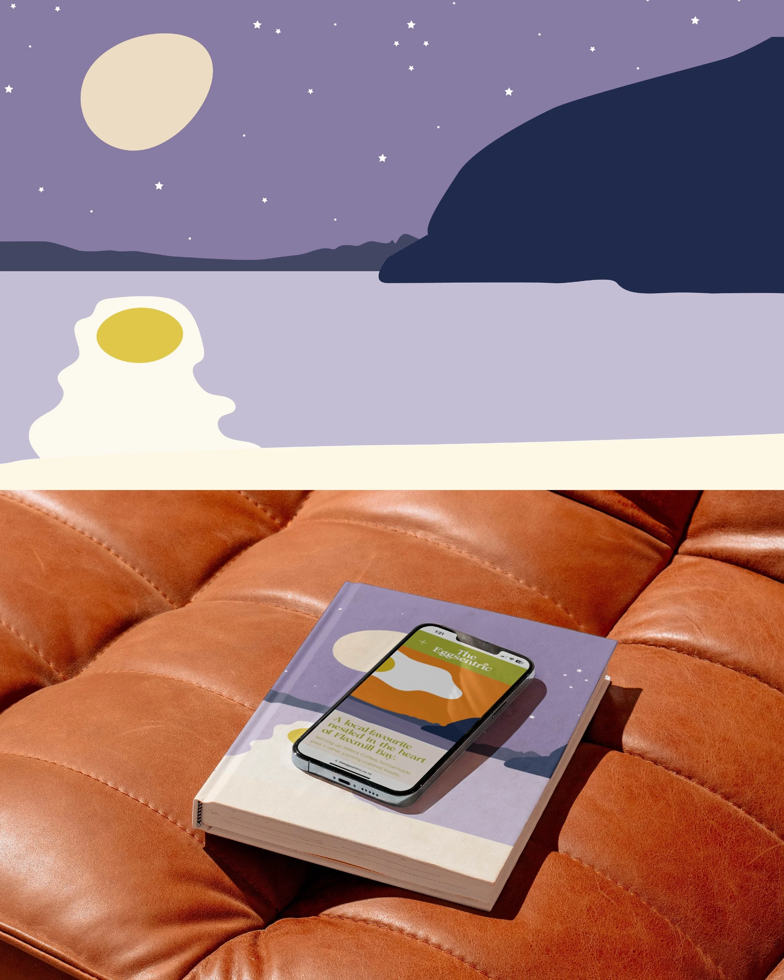
From there, the illustrations grew into a whole playful world, including Flaxmill Bay day and night scenes. It’s been a project that other clients have referenced for their own branding, which is always a huge compliment.
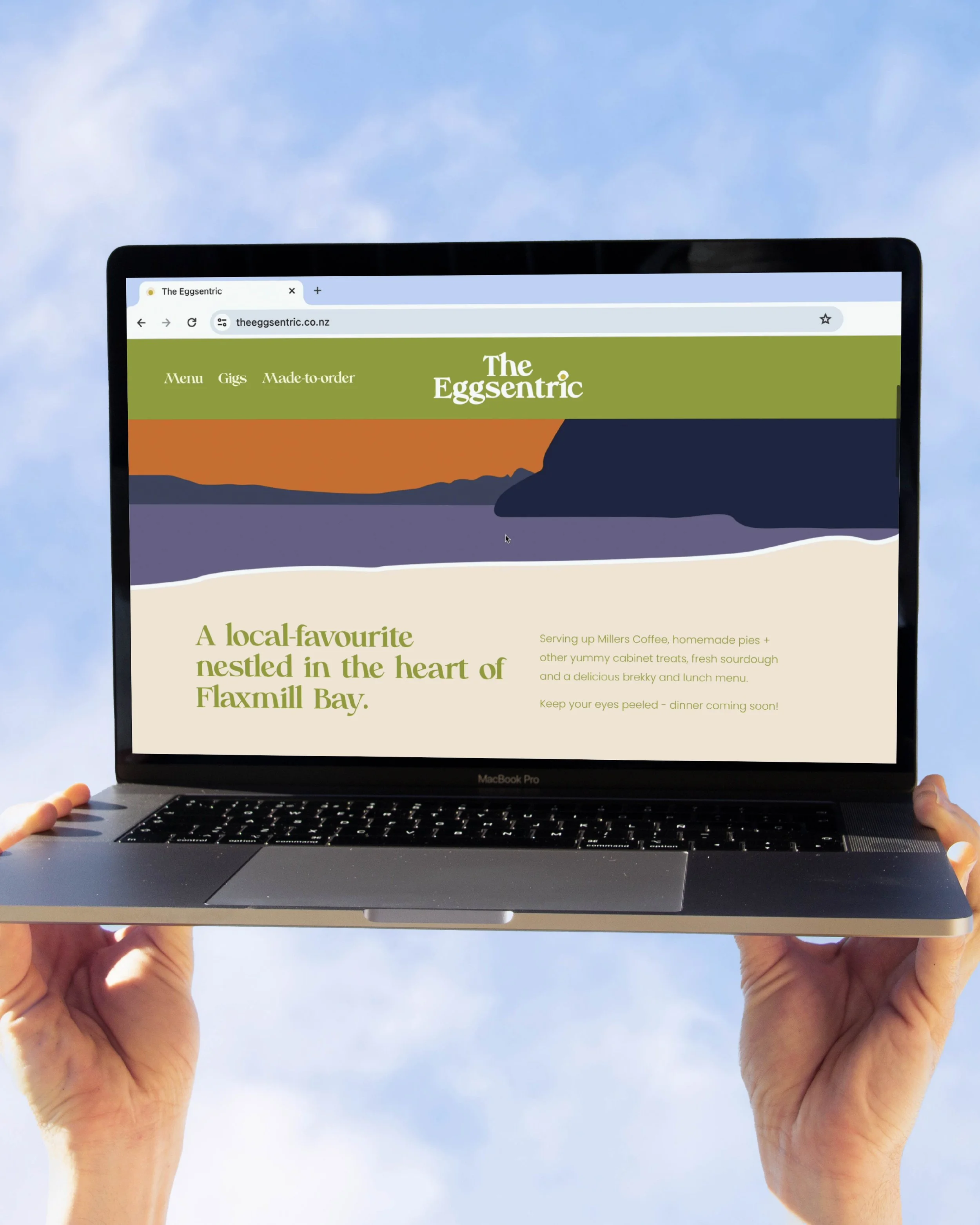
We later carried that same charm and funk into a small but functional Squarespace website.
What we created:
Full brand identity
Custom illustrated brand assets
Colour palette & typography
Brand guidelines
Squarespace website
Brand Identity
Illustration
Squarespace Website
Ongoing Creative
● Work
Kaitiaki Conservation
Kaitiaki Conservation is a full-service conservation company working across biodiversity monitoring, predator control, wildlife management and ecological restoration throughout Aotearoa.
This project was a chance to create something more bespoke and detailed, with every element carefully considered given the nature of Kaitiaki’s work and its connection to mātauranga and Māori culture.
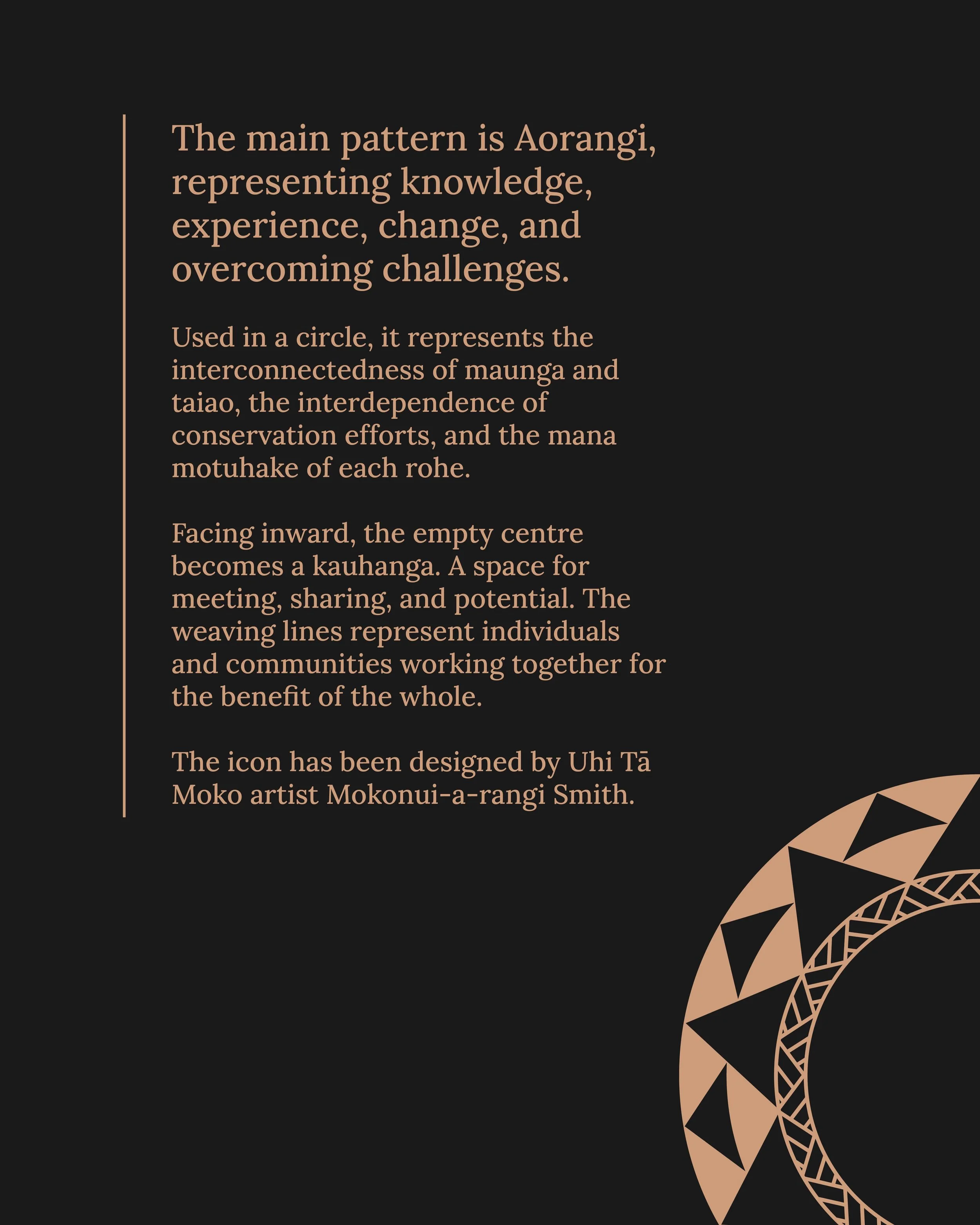
The original icon was designed by Uhi Tā Moko artist Mokonui-a-rangi Smith, which I carefully vectorised before building the wider identity around it. The earthy colour palette, typography and supporting elements were all intentionally chosen to feel grounded in the landscape and reflect the considered nature of their work.
We’re now carrying the identity through into a new website.
What we created:
Brand identity
Icon vectorisation
Colour palette & typography
Supporting brand elements
Brand guidelines
Website
// @kaitiaki_conservation, website in progress

Brand Identity
Website
Brand Identity
Social Content
Squarespace
Website
Brand Identity
Squarespace
Website
Brand Identity
Brand Identity
Social Content
● Contact
Let’s work together
Whether you’re starting from scratch, giving things a refresh or just need a designer in your corner, I’d love to hear what you’re working on.